We developed the visual identity for PORTO – Comunidade Cristã, a brand that embodies belonging, renewal, and purpose. Inspired by the metaphor of a safe harbor, the identity combines Christian and nautical symbols to convey faith and stability. The result is a striking and inspiring visual communication, aligned with the community’s mission.
OVERVIEW
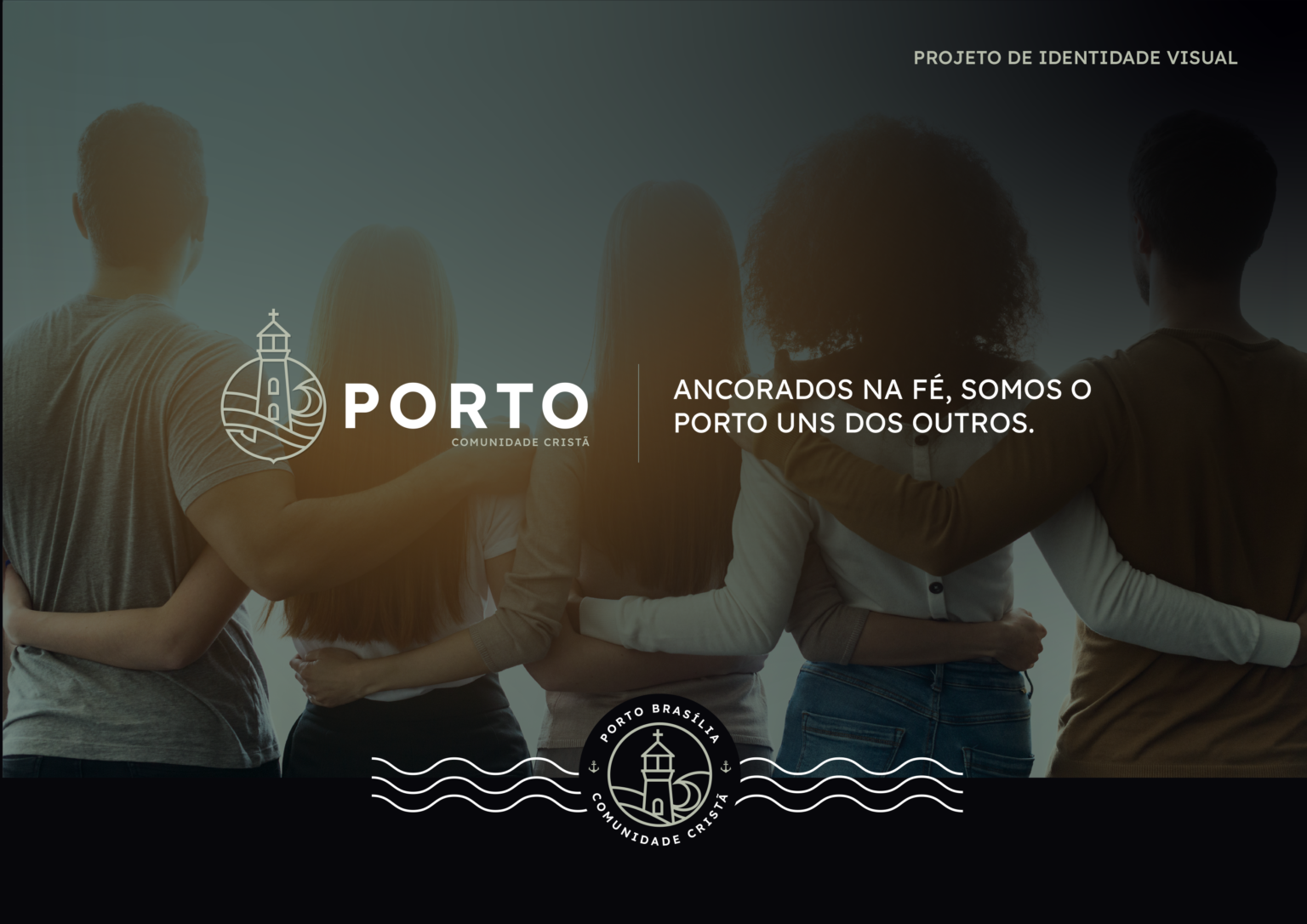
The Visual Identity Project for PORTO – Comunidade Cristã uses the metaphor of a journey at sea to represent the spiritual path and life’s challenges. The concept of a port symbolizes refuge, renewal, and direction, reflecting the community’s mission to welcome and guide those in need of support. productivity and decision-making processes.
CHALLENGES & APPROACH
Challenge: Create a visual identity that conveys faith, belonging, and purpose.
Approach: The design incorporates Christian and nautical symbols, such as the cross, lighthouse, anchor, and waves, reinforcing values of stability, guidance, and hope. The color palette features soft, natural tones, evoking serenity and trust.
THE RESULT
The visual identity of PORTO – Comunidade Cristã communicates warmth and purpose, strengthening the brand’s connection with its members and reinforcing its role as a source of support on the journey of faith.