Planeta energia
Branding

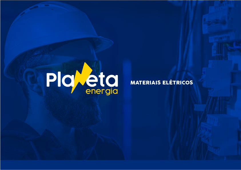
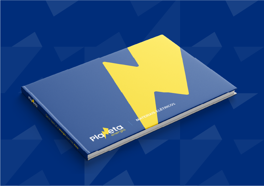
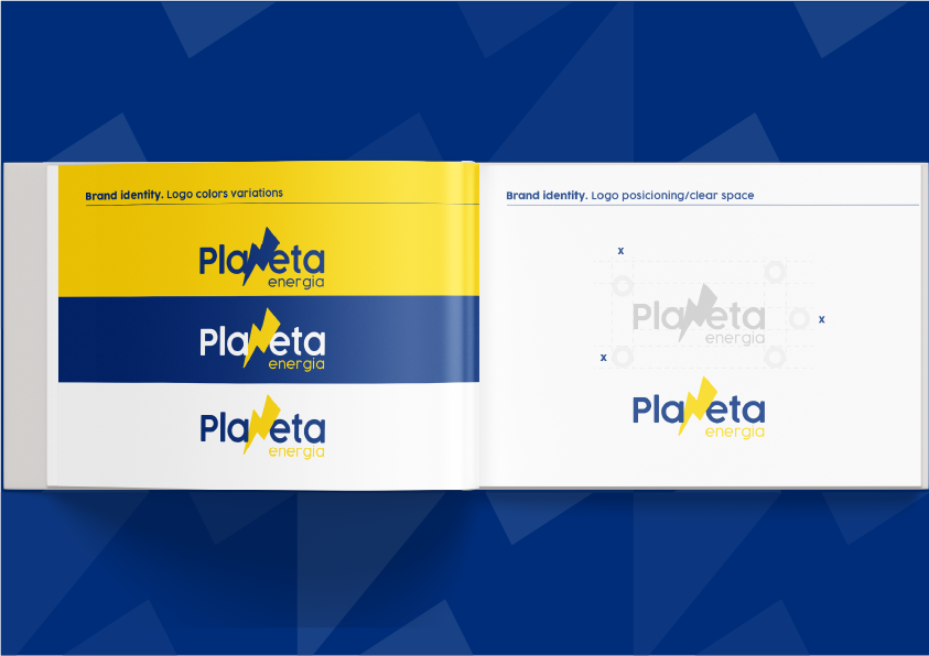
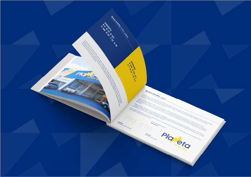
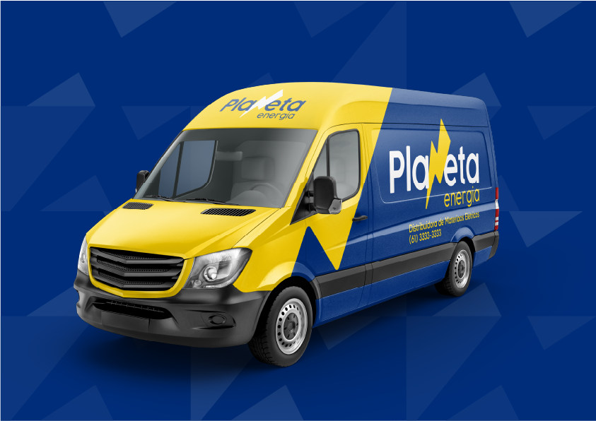
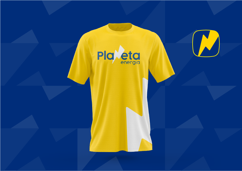
We developed the visual identity for Planeta Energia, a brand that symbolizes connection, strength, and innovation in the electrical materials sector. The modern and minimalist design incorporates a lightning bolt in the typography, representing the energy that powers the world. The result is a strong and memorable visual identity, aligned with the mission of illuminating and connecting people with reliable solutions
OVERVIEW
The visual identity of Planeta Energia was designed to reflect not only the products offered but also the essence of energy in our daily lives. The brand conveys strength, connection, and modernity, highlighting the vital role of electricity in everyday life.
CHALLENGES & APPROACH
- Challenge: Create a visual identity that represents electricity in a dynamic and memorable way.
- Approach: The name “Planeta” symbolizes a connected world, while the lightning bolt replacing the letter “N” represents electricity as a vital force. The minimalist yet striking design reinforces the brand’s reliability and innovation.
THE RESULT
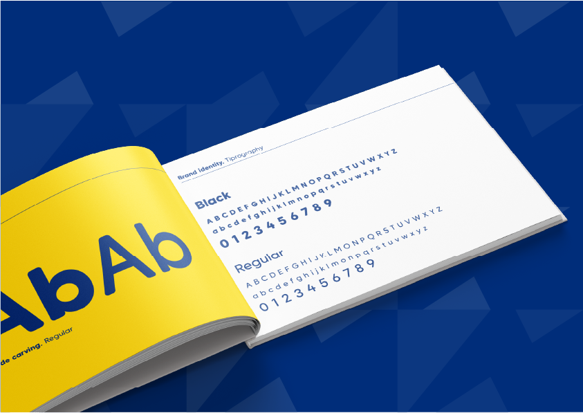
The Planeta Energia visual identity is vibrant, modern, and functional, reflecting its mission to provide electrical materials that connect and illuminate people’s lives.
